
Most professionals reuse one headshot everywhere-and that is completely reasonable. The problem is not using one photo. The problem is using one photo without preparing it for different platforms.
Each platform crops differently, displays color differently, and implies a different level of formality. If you upload the same uncropped file everywhere, you can end up looking inconsistent even when the image is the same:
- LinkedIn circle crop cuts your head awkwardly
- your website banner needs negative space and a horizontal orientation
- your email signature compresses and blurs details
- a company bio page places your photo on a colored background that clashes
- social platforms apply filters or compression that shifts skin tone
This post shows you how to use one headshot across platforms while staying consistent and professional-without needing a whole photoshoot for every use.
The goal: consistency of identity and brand tone
Using one headshot across platforms works when these stay consistent:
- Recognition (you look like you; face is clear)
- Tone (warm vs authoritative; corporate vs modern)
- Color harmony (the image doesn’t clash with each platform’s layout)
- Quality (no pixelation, awkward cropping, or heavy compression)
“Off-brand” usually means one of those four broke.
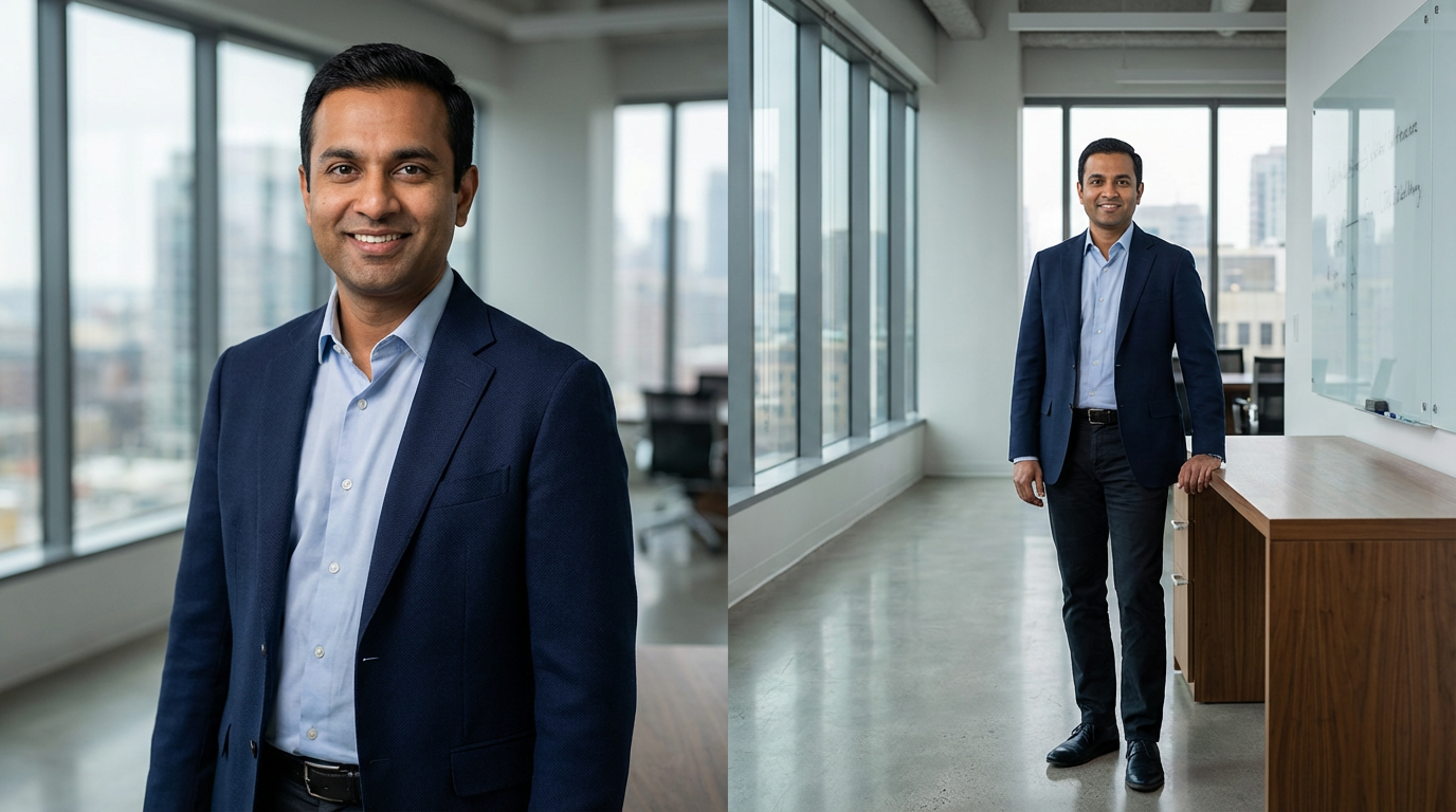
Step 1: Start with the right “base” headshot
Not every photo makes a good universal headshot. The best base image for multi-platform use is:
- clean background (neutral or quiet environmental)
- flattering, controlled lighting (natural skin tone)
- expression that sits in the middle (confident, approachable)
- wardrobe that is timeless and role-appropriate
- composition that allows multiple crops (not too tight, not too wide)
If you choose a highly stylized or trendy image as your base, it will break in at least one platform context.
Best universal expression: a soft smile (calm, credible, approachable). This tends to work across corporate and personal brand environments.
Step 2: Prepare a “platform crop set” (this is the secret)
You are not actually using “one headshot.” You are using one headshot with multiple crops and exports.
Create these versions from your base image:
A) LinkedIn avatar crop (square/circle-safe)
- tight head-and-shoulders
- face large enough for mobile viewing
- enough space so the circle crop doesn’t cut hair/shoulders awkwardly
Common mistake: too wide → face too small.
B) Website bio crop (vertical or 4:5)
- slightly wider than LinkedIn
- allows comfortable framing on About/team pages
C) Website banner crop (horizontal, with negative space)
- subject placed left or right
- extra space for headline text or layout
- background stays quiet
D) Press/print crop (high-res, neutral)
- typically a clean portrait crop
- exported at higher resolution
- minimal compression
E) Email signature crop (small and crisp)
- simple crop; avoid too much background
- exported at small pixel dimensions so it looks sharp
- keep file size reasonable for email
If you do nothing else, do this. A crop set prevents 80% of “off-brand” problems.
Step 3: Match your headshot to each platform’s visual environment
Your headshot interacts with page colors, fonts, and layouts.
- circular crop
- often shown small
- sits near the banner
Best practice: keep your headshot clean, high contrast enough to read at thumbnail size, and aligned with banner color tone (not necessarily matching, but harmonious).
- Company website team page
- often displayed in a grid
- backgrounds can vary (white, gray, brand color)
Best practice: use a crop with consistent framing and neutral background if possible. Avoid environmental backgrounds that look different from everyone else (unless the whole team does environmental consistently).
- Personal website About page
- often used larger
- can support a more personal tone
Best practice: use a slightly wider crop and consider a version with a touch more warmth and personality.
- Speaker page / press kit
- image may be used by others
- often needs “clean and universal”
Best practice: provide a high-res version with neutral background and minimal stylization.
- Instagram / Facebook
- platforms compress heavily
- people scroll quickly
Best practice: use the 4:5 crop where possible; ensure eyes are sharp and face is large enough. Avoid tiny faces inside a large background.
Step 4: Keep color consistent (avoid “why do I look different?”)
Color shifts are common when:
- images are exported incorrectly
- platforms compress and change saturation
- a website’s background color clashes with your image tone
- Simple fixes
- keep backgrounds neutral or quiet
- avoid extreme warmth or coolness in editing
- don’t use heavy filters on the same photo for different platforms
export web versions in standard formats and sizes (not huge files that platforms recompress aggressively)
Rule: Your skin tone should look consistent across LinkedIn and your website. If it doesn’t, you likely need platform-specific exports.
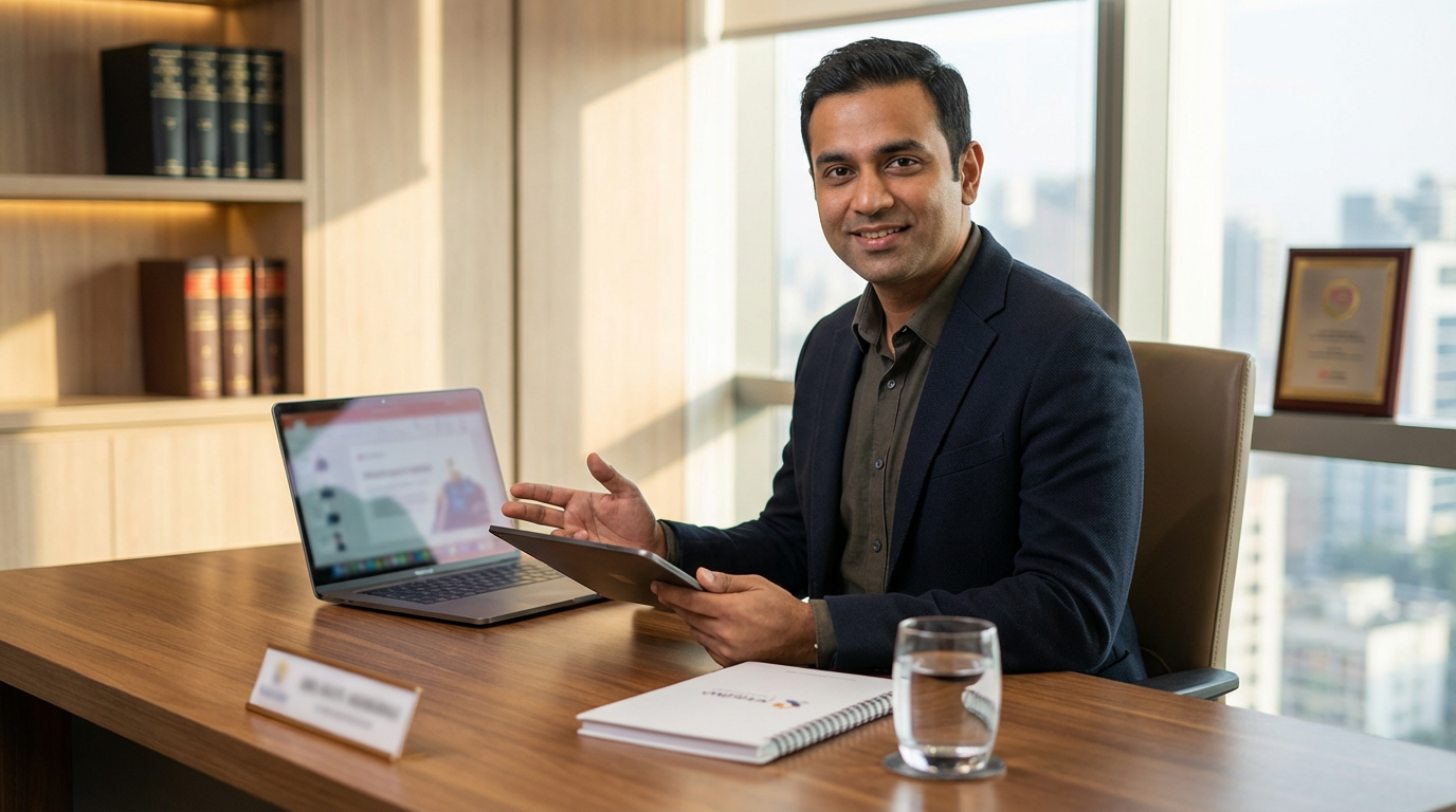
Step 5: Maintain brand tone with wardrobe and expression (not graphics)
Many people try to “brand” their headshot by adding overlays, logos, or text. That almost always makes it look less professional.
Instead, your brand tone should come from:
- wardrobe formality level (corporate vs modern vs creative)
- expression style (warm vs authoritative)
- background choice (clean vs contextual)
- lighting style (soft modern vs more sculpted premium)
If you want to shift brand tone across platforms, do it through layout and supporting design-not by altering the headshot itself.
Step 6: Avoid the common “off-brand” traps
Here are the most frequent ways people accidentally look inconsistent:
- Trap 1: Using a different headshot on every platform
People want to recognize you. If you use three different photos (different hair, different vibe), you lose recognition and trust.
Fix: choose one primary image and keep it consistent; use secondary images only on deeper brand pages.
- Trap 2: Letting platforms auto-crop
Auto-crop is rarely flattering.
Fix: upload a pre-cropped, avatar-safe version.
- Trap 3: Using an outdated headshot in one place
If LinkedIn is current but your company bio page is 7 years old, people notice.
Fix: update all key platforms in one session: LinkedIn, website, company bio, Google Business profile (if applicable), email signature.
- Trap 4: Over-editing for one platform
If your Instagram version is filtered and your LinkedIn version is natural, your “brand” splits.
Fix: keep retouching consistent and identity-preserving everywhere.
- The “one headshot” platform package (what you should request)
If you’re hiring a headshot photographer and want one image to work everywhere, ask for:
- LinkedIn crop (square/circle-safe)
- website bio crop (vertical)
- website banner crop (horizontal with negative space)
- high-res print/press version
- web-optimized versions (smaller file sizes, sharp output)
- consistent naming (so you can find the right file fast)
This is what turns one headshot into a universal asset.
Checklist: can your headshot work everywhere?
- The base image is timeless and role-appropriate
- I have a LinkedIn-safe crop (not relying on auto-crop)
- I have a horizontal banner crop with negative space
- I have a website bio crop that frames well
- Skin tone looks consistent across platforms
- I’m using the same primary headshot everywhere that matters
- The image is current (updated within a reasonable timeline)
If you’re missing the crop set, fix that first.
- FAQ (schema-friendly)
Can I really use one headshot everywhere? Yes, if it’s a clean, versatile base image and you prepare platform-specific crops and exports. Most “off-brand” issues are cropping and compression problems.
Should I use different photos for LinkedIn and my website? Not necessarily. Many professionals use the same base image. If your website is more personal-brand focused, you might add a secondary image deeper on the site while keeping your primary headshot consistent.
Why does my headshot look different after I upload it? Platforms compress images and may alter sharpness and color. Exporting correctly sized web versions reduces this problem.
What’s the best crop for LinkedIn? Head-and-shoulders with your face large enough to read on mobile, and enough breathing room so the circular crop doesn’t cut awkwardly.
Ready to Get Started?
If you want your profile to feel consistent and premium, start by building a crop set from one strong base headshot-LinkedIn, website, and press-ready versions.
If you want one headshot that works everywhere-without guessing on crops, color, and exports-book a consultation and we’ll plan a universal headshot with platform-ready deliverables for LinkedIn, your website, and professional use.
Book a Consultation | View Session Options & Pricing | See the Portfolio